
EnterpriSe application design
Reimagining Orbixa VMS Software
Reimagining Orbixa VMS Software
Designing seamless, scalable surveillance systems trusted by government and public organizations for everyday security monitoring
Designing seamless, scalable surveillance systems trusted by government and public organizations for everyday security monitoring
Industry :
Video management software
Client :
Orbixa Vision Pvt. Ltd.
Project Overview
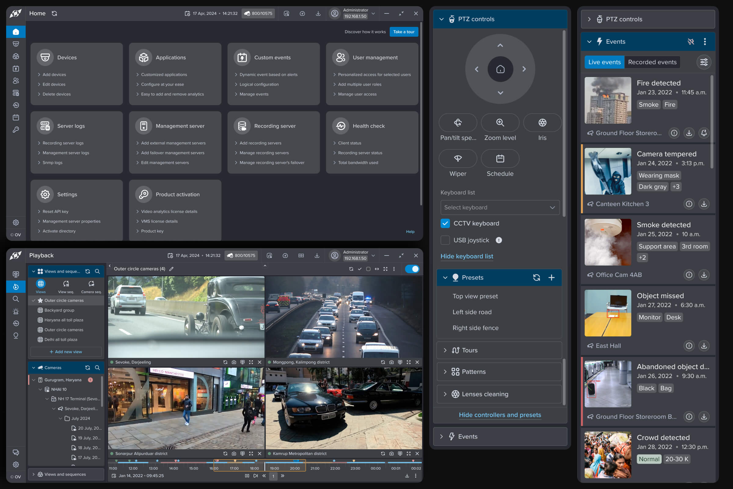
When managing hundreds of live surveillance feeds became inefficient and error-prone, I led a ground-up redesign to create a faster, unified, and intuitive experience.
Background
Orbixa Vision video management Software (VMS) is a flagship enterprise tool used by government and public sector organizations, including Indian Railways, airports, and police headquarters.
Operators and administrators rely on it daily to record, monitor, and manage surveillance videos across complex, high-stakes environments.
The Challenge
The legacy VMS was functional but outdated. Operators struggled with complex navigation, inconsistent design patterns, and steep learning curves.
The UI didn't align with other Orbixa's products, and usability issues prevented the product from scaling globally.
Core problems identified


Research & Insights
Method 01
Competitor analysis
Benchmarked global VMS leaders for UI/UX standards
Method 02
Support insights
Interviewed 4 to 5 internal stakeholders across support and product, and reviewed recorded operator calls to identify recurring pain points
Key findings
62%
of support tickets were usability-related, not technical failures
30-40%
more clicks required for common tasks compared to competitors
5-10%
alignment with global accessibility and usability standards
Support ticket breakdown
Analysis of customer support data revealed that the majority of issues weren't technical bugs, they were usability problems. This insight became the foundation for our redesign strategy.
62%
62%
Usability Issues
Usability Issues
25%
25%
Technical Issues
Technical Issues
13%
13%
Training Gaps
Training Gaps
Navigation efficiency gap
Task analysis showed that our system required significantly more steps to complete common operations compared to industry-leading competitors. This inefficiency translated directly into wasted operator time and increased error rates.
Targets we set before build
These were improvement targets derived from competitor benchmarking, set before the redesign shipped. They are not measured results. What actually happened after launch is in Outcome & Impact below.
EXPLORATION
Three answers to the same screen
We approached one interface from three distinct directions, testing how far the same screen could flex before committing to a single, deliberate path forward.
01
BEFORE

The inherited layout
The original screen carried years of patched-on features, leaving operators to hunt for the controls they used most.
02
EXPLORED

The focused view
A stripped-back variant surfaced only the primary task, hiding secondary tools behind progressive disclosure to reduce cognitive load.
03
CARRIED FORWARD


The balanced system
The final direction kept the clarity of the focused view while restoring quick access to the controls operators reached for daily.
WHAT ACTUALLY CHANGED
Committing to a single direction meant fewer choices on screen, not fewer capabilities. Operators reached their most frequent actions in one step, while the deeper toolset stayed one deliberate tap away.
DECISIONS
What I designed and what I didn't
Each of these was a choice with more than one answer. Here's what we took, what we passed on, and what it cost.
Decision 1
Decision 2
Decision 3
Decision 4
01
Fix this product, or build the system
The options
Fix VMS and move on. Ships sooner, and it's what everyone expected. Or build a design system from zero across all three products, which had the same inconsistency and the same accessibility gaps.
What we took
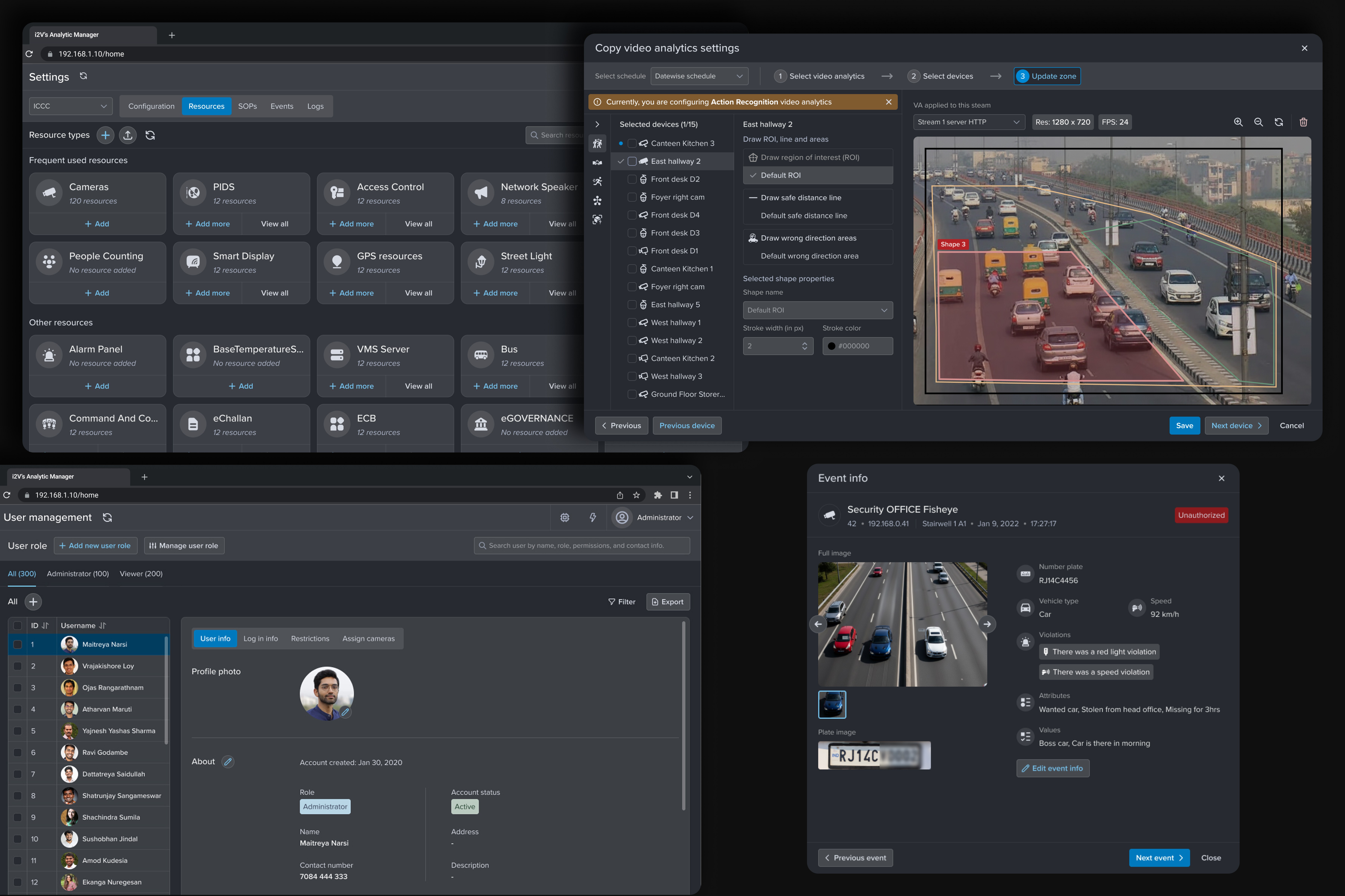
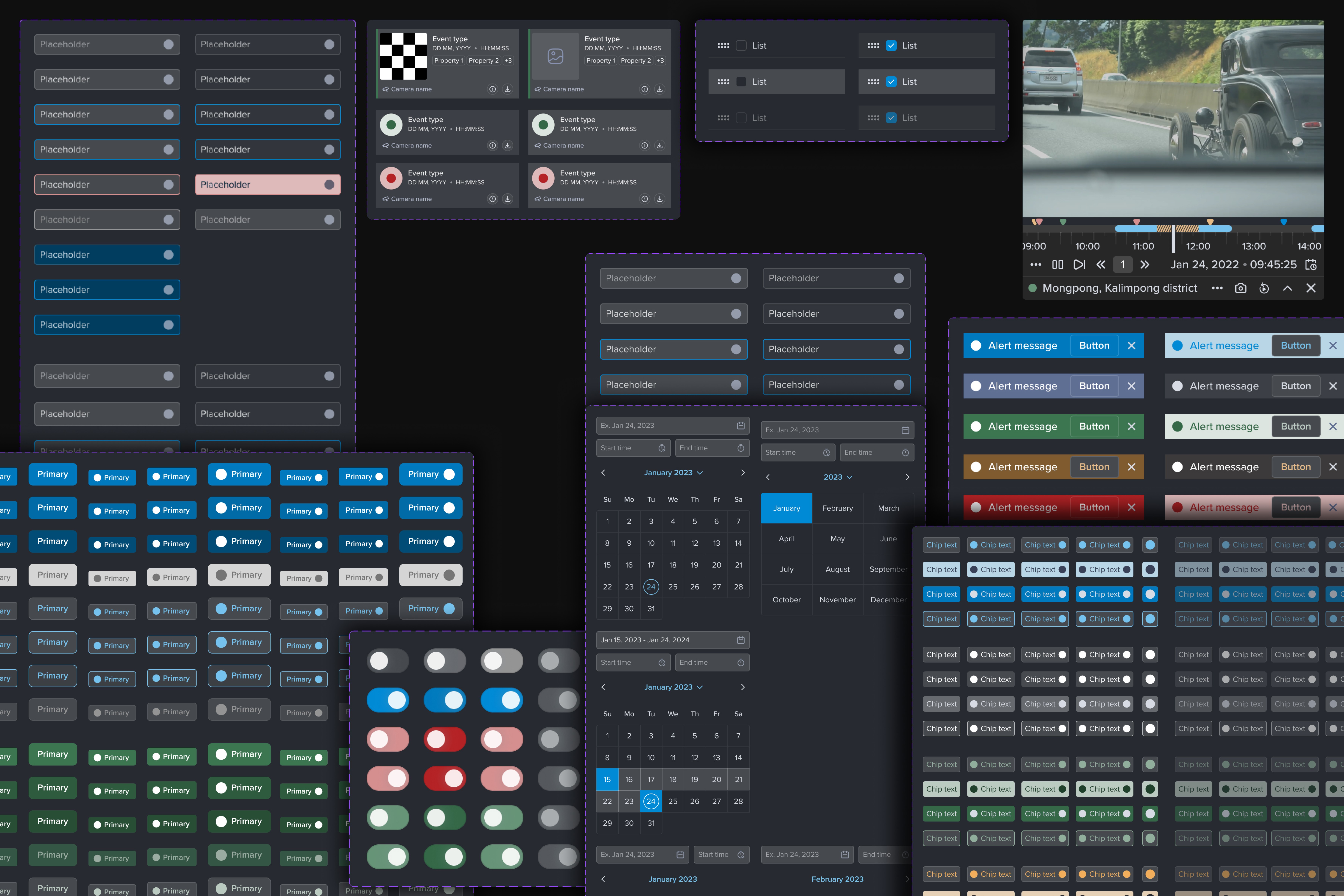
The system. Components, use cases, spacing and type tokens defined once. Every state, focus, error, disabled, empty, lives in the library, so accessibility is structural instead of fixed screen by screen. Developers pull from one source. QA validates against the system while modules are built, not after.
What it cost
Time on this release, and a maintenance burden we now own, including the accessibility work a mature library would have given us free. Taken because in an operator product the behaviour of the components is the product.


THE THROUGH-LINE
None of these decisions were about adding more. Each one traded surface complexity for a clearer path through the task, and together they turned a crowded tool into something operators trusted at a glance.
The Challenges
Legacy technology constraints
The existing system was built on Windows Presentation Foundation (WPF), requiring careful consideration of platform limitations while pushing for modern design patterns.
Design language unification
Orbixa had multiple products with inconsistent interfaces. Creating a unified system that worked across all platforms while respecting individual product needs was complex.
Security & simplicity balance
Designing for high-security environments meant balancing strict access controls and detailed logging with the need for an intuitive, accessible interface.


Outcome & Impact


"The redesigned VMS helped us align our visual language across products while making the experience significantly easier for on-ground operators."
— Internal Product Owner, Orbixa Vision

KEY LEARNING
"In high-stakes environments, clarity and speed matter more than aesthetics."
"In high-stakes environments, clarity and speed matter more than aesthetics."
Designing for surveillance systems taught me that beauty in design comes from function, when operators can respond faster, make fewer errors, and trust the interface completely.
Designing for surveillance systems taught me that beauty in design comes from function, when operators can respond faster, make fewer errors, and trust the interface completely.
My Role
As Senior Product Designer, I led the end-to-end redesign of the VMS platform, from research and strategy through to final implementation and developer handoff.
Research & Discovery
—
Analyzed support insights and competitor products to identify workflow inefficiencies
—
Conducted stakeholder interviews with the support and product teams, and reviewed recorded operator support calls
—
Mapped five operator-side roles, operator, administrator, investigator, support and pre-sales, against what each is measured on and where their workflow breaks
Design & Systems
—
Redesigned core workflows including video analytics, camera management, and logs
—
Built scalable design system adaptable to Windows (WPF) and multiple products
—
Built accessibility into the design system by auditing WCAG 2.1 AA and defining focus, error, disabled, empty, and failure states, making compliance structural, not screen-specific.
Collaboration
—
Partnered with PMs to align design decisions with business goals
—
Worked closely with developers to ensure accurate implementation
—
Coordinated with QA team for usability validation and testing
Impact
—
62% of support tickets were usability issues, the number that made the business case internally
—
The design system now runs across the Orbixa Vision product line
—
The accessibility work is what makes Middle East and Europe deployment a conversation at all
More Projects

Hi
Hi
Curious about the process behind the pixels?
Dive into the stories behind each project, how design decisions shaped better user experiences.
EnterpriSe application design
Reimagining Orbixa VMS Software
Reimagining Orbixa VMS Software
Designing seamless, scalable surveillance systems trusted by government and public organizations for everyday security monitoring
Designing seamless, scalable surveillance systems trusted by government and public organizations for everyday security monitoring
Industry :
Video management software
Client :
Orbixa Vision Pvt. Ltd.
Project Overview
When managing hundreds of live surveillance feeds became inefficient and error-prone, I led a ground-up redesign to create a faster, unified, and intuitive experience.
Background
Orbixa Vision video management Software (VMS) is a flagship enterprise tool used by government and public sector organizations, including Indian Railways, airports, and police headquarters.
Operators and administrators rely on it daily to record, monitor, and manage surveillance videos across complex, high-stakes environments.
The Challenge
The legacy VMS was functional but outdated. Operators struggled with complex navigation, inconsistent design patterns, and steep learning curves.
The UI didn't align with other Orbixa's products, and usability issues prevented the product from scaling globally.
Core problems identified
Research & Insights
Method 01
Competitor analysis
Benchmarked global VMS leaders for UI/UX standards
Method 02
Support insights
Interviewed 4 to 5 internal stakeholders across support and product, and reviewed recorded operator calls to identify recurring pain points
Key findings
62%
of support tickets were usability-related, not technical failures
30-40%
more clicks required for common tasks compared to competitors
5-10%
alignment with global accessibility and usability standards
Support ticket breakdown
Analysis of customer support data revealed that the majority of issues weren't technical bugs, they were usability problems. This insight became the foundation for our redesign strategy.
62%
62%
Usability Issues
Usability Issues
25%
25%
Technical Issues
Technical Issues
13%
13%
Training Gaps
Training Gaps
Navigation efficiency gap
Task analysis showed that our system required significantly more steps to complete common operations compared to industry-leading competitors. This inefficiency translated directly into wasted operator time and increased error rates.
Targets we set before build
These were improvement targets derived from competitor benchmarking, set before the redesign shipped. They are not measured results. What actually happened after launch is in Outcome & Impact below.
EXPLORATION
Three answers to the same screen
We approached one interface from three distinct directions, testing how far the same screen could flex before committing to a single, deliberate path forward.
01
BEFORE
The inherited layout
The original screen carried years of patched-on features, leaving operators to hunt for the controls they used most.
02
EXPLORED
The focused view
A stripped-back variant surfaced only the primary task, hiding secondary tools behind progressive disclosure to reduce cognitive load.
03
CARRIED FORWARD
The balanced system
The final direction kept the clarity of the focused view while restoring quick access to the controls operators reached for daily.
WHAT ACTUALLY CHANGED
Committing to a single direction meant fewer choices on screen, not fewer capabilities. Operators reached their most frequent actions in one step, while the deeper toolset stayed one deliberate tap away.
DECISIONS
What I designed and what I didn't
Each of these was a choice with more than one answer. Here's what we took, what we passed on, and what it cost.
Decision 1
Decision 2
Decision 3
Decision 4
01
Fix this product, or build the system
The options
Fix VMS and move on. Ships sooner, and it's what everyone expected. Or build a design system from zero across all three products, which had the same inconsistency and the same accessibility gaps.
What we took
The system. Components, use cases, spacing and type tokens defined once. Every state, focus, error, disabled, empty, lives in the library, so accessibility is structural instead of fixed screen by screen. Developers pull from one source. QA validates against the system while modules are built, not after.
What it cost
Time on this release, and a maintenance burden we now own, including the accessibility work a mature library would have given us free. Taken because in an operator product the behaviour of the components is the product.
THE THROUGH-LINE
None of these decisions were about adding more. Each one traded surface complexity for a clearer path through the task, and together they turned a crowded tool into something operators trusted at a glance.
The Challenges
Legacy technology constraints
The existing system was built on Windows Presentation Foundation (WPF), requiring careful consideration of platform limitations while pushing for modern design patterns.
Design language unification
Orbixa had multiple products with inconsistent interfaces. Creating a unified system that worked across all platforms while respecting individual product needs was complex.
Security & simplicity balance
Designing for high-security environments meant balancing strict access controls and detailed logging with the need for an intuitive, accessible interface.
Outcome & Impact
"The redesigned VMS helped us align our visual language across products while making the experience significantly easier for on-ground operators."
— Internal Product Owner, Orbixa Vision
KEY LEARNING
"In high-stakes environments, clarity and speed matter more than aesthetics."
"In high-stakes environments, clarity and speed matter more than aesthetics."
Designing for surveillance systems taught me that beauty in design comes from function, when operators can respond faster, make fewer errors, and trust the interface completely.
Designing for surveillance systems taught me that beauty in design comes from function, when operators can respond faster, make fewer errors, and trust the interface completely.
My Role
As Senior Product Designer, I led the end-to-end redesign of the VMS platform, from research and strategy through to final implementation and developer handoff.
Research & Discovery
—
Analyzed support insights and competitor products to identify workflow inefficiencies
—
Conducted stakeholder interviews with the support and product teams, and reviewed recorded operator support calls
—
Mapped five operator-side roles, operator, administrator, investigator, support and pre-sales, against what each is measured on and where their workflow breaks
Design & Systems
—
Redesigned core workflows including video analytics, camera management, and logs
—
Built scalable design system adaptable to Windows (WPF) and multiple products
—
Built accessibility into the design system by auditing WCAG 2.1 AA and defining focus, error, disabled, empty, and failure states, making compliance structural, not screen-specific.
Collaboration
—
Partnered with PMs to align design decisions with business goals
—
Worked closely with developers to ensure accurate implementation
—
Coordinated with QA team for usability validation and testing
Impact
—
62% of support tickets were usability issues, the number that made the business case internally
—
The design system now runs across the Orbixa Vision product line
—
The accessibility work is what makes Middle East and Europe deployment a conversation at all
More Projects
Hi
Hi
Curious about the process behind the pixels?
Dive into the stories behind each project, how design decisions shaped better user experiences.
EnterpriSe application design
Reimagining Orbixa VMS Software
Reimagining Orbixa VMS Software
Designing seamless, scalable surveillance systems trusted by government and public organizations for everyday security monitoring
Designing seamless, scalable surveillance systems trusted by government and public organizations for everyday security monitoring
Industry :
Video management software
Client :
Orbixa Vision Pvt. Ltd.
Project Overview
When managing hundreds of live surveillance feeds became inefficient and error-prone, I led a ground-up redesign to create a faster, unified, and intuitive experience.
Background
Orbixa Vision video management Software (VMS) is a flagship enterprise tool used by government and public sector organizations, including Indian Railways, airports, and police headquarters.
Operators and administrators rely on it daily to record, monitor, and manage surveillance videos across complex, high-stakes environments.
The Challenge
The legacy VMS was functional but outdated. Operators struggled with complex navigation, inconsistent design patterns, and steep learning curves.
The UI didn't align with other Orbixa's products, and usability issues prevented the product from scaling globally.
Core problems identified
Research & Insights
Method 01
Competitor analysis
Benchmarked global VMS leaders for UI/UX standards
Method 02
Support insights
Interviewed 4 to 5 internal stakeholders across support and product, and reviewed recorded operator calls to identify recurring pain points
Key findings
62%
of support tickets were usability-related, not technical failures
30-40%
more clicks required for common tasks compared to competitors
5-10%
alignment with global accessibility and usability standards
Support ticket breakdown
Analysis of customer support data revealed that the majority of issues weren't technical bugs, they were usability problems. This insight became the foundation for our redesign strategy.
62%
62%
Usability Issues
Usability Issues
25%
25%
Technical Issues
Technical Issues
13%
13%
Training Gaps
Training Gaps
Navigation efficiency gap
Task analysis showed that our system required significantly more steps to complete common operations compared to industry-leading competitors. This inefficiency translated directly into wasted operator time and increased error rates.
Targets we set before build
These were improvement targets derived from competitor benchmarking, set before the redesign shipped. They are not measured results. What actually happened after launch is in Outcome & Impact below.
EXPLORATION
Three answers to the same screen
We approached one interface from three distinct directions, testing how far the same screen could flex before committing to a single, deliberate path forward.
01
BEFORE
The inherited layout
The original screen carried years of patched-on features, leaving operators to hunt for the controls they used most.
02
EXPLORED
The focused view
A stripped-back variant surfaced only the primary task, hiding secondary tools behind progressive disclosure to reduce cognitive load.
03
CARRIED FORWARD
The balanced system
The final direction kept the clarity of the focused view while restoring quick access to the controls operators reached for daily.
WHAT ACTUALLY CHANGED
Committing to a single direction meant fewer choices on screen, not fewer capabilities. Operators reached their most frequent actions in one step, while the deeper toolset stayed one deliberate tap away.
DECISIONS
What I designed and what I didn't
Each of these was a choice with more than one answer. Here's what we took, what we passed on, and what it cost.
Decision 1
Decision 2
Decision 3
Decision 4
01
Fix this product, or build the system
The options
Fix VMS and move on. Ships sooner, and it's what everyone expected. Or build a design system from zero across all three products, which had the same inconsistency and the same accessibility gaps.
What we took
The system. Components, use cases, spacing and type tokens defined once. Every state, focus, error, disabled, empty, lives in the library, so accessibility is structural instead of fixed screen by screen. Developers pull from one source. QA validates against the system while modules are built, not after.
What it cost
Time on this release, and a maintenance burden we now own, including the accessibility work a mature library would have given us free. Taken because in an operator product the behaviour of the components is the product.
THE THROUGH-LINE
None of these decisions were about adding more. Each one traded surface complexity for a clearer path through the task, and together they turned a crowded tool into something operators trusted at a glance.
The Challenges
Legacy technology constraints
The existing system was built on Windows Presentation Foundation (WPF), requiring careful consideration of platform limitations while pushing for modern design patterns.
Design language unification
Orbixa had multiple products with inconsistent interfaces. Creating a unified system that worked across all platforms while respecting individual product needs was complex.
Security & simplicity balance
Designing for high-security environments meant balancing strict access controls and detailed logging with the need for an intuitive, accessible interface.
Outcome & Impact
"The redesigned VMS helped us align our visual language across products while making the experience significantly easier for on-ground operators."
— Internal Product Owner, Orbixa Vision
KEY LEARNING
"In high-stakes environments, clarity and speed matter more than aesthetics."
"In high-stakes environments, clarity and speed matter more than aesthetics."
Designing for surveillance systems taught me that beauty in design comes from function, when operators can respond faster, make fewer errors, and trust the interface completely.
Designing for surveillance systems taught me that beauty in design comes from function, when operators can respond faster, make fewer errors, and trust the interface completely.
My Role
As Senior Product Designer, I led the end-to-end redesign of the VMS platform, from research and strategy through to final implementation and developer handoff.
Research & Discovery
—
Analyzed support insights and competitor products to identify workflow inefficiencies
—
Conducted stakeholder interviews with the support and product teams, and reviewed recorded operator support calls
—
Mapped five operator-side roles, operator, administrator, investigator, support and pre-sales, against what each is measured on and where their workflow breaks
Design & Systems
—
Redesigned core workflows including video analytics, camera management, and logs
—
Built scalable design system adaptable to Windows (WPF) and multiple products
—
Built accessibility into the design system by auditing WCAG 2.1 AA and defining focus, error, disabled, empty, and failure states, making compliance structural, not screen-specific.
Collaboration
—
Partnered with PMs to align design decisions with business goals
—
Worked closely with developers to ensure accurate implementation
—
Coordinated with QA team for usability validation and testing
Impact
—
62% of support tickets were usability issues, the number that made the business case internally
—
The design system now runs across the Orbixa Vision product line
—
The accessibility work is what makes Middle East and Europe deployment a conversation at all
More Projects
Hi
Hi
Curious about the process behind the pixels?
Dive into the stories behind each project, how design decisions shaped better user experiences.